After the coronavirus pandemic, I am now returning to complete some normal photography activities and below is a piece of work that I have completed today. However due to the coronavirus we are restricted to do a lot of normal activities, so we have to think differently about how we approach things. This experience has been a really weird time for everyone, however things are slowly getting back to a bit of normality, including that I am now back to continuing my photography work after a long six months of lockdown.

Different Photography Instructions
1) Don't get your hands in the way of when you take a photograph because it will blur it, so always have your hands and fingers behind your phone or camera.
2) Don't rush a photograph that you want to take, because it might not look as good as if you just take your time and try to get the best shot that you can take.
3) When you see something that you don't see a lot, like something that looks good in the sky take a photograph and that would look good on your website or anything like that.
4) Similar to instruction 3, but if you take a picture of something like your shadow in a nice sunny day, you can even edit it on your phone to turn it to a different background to make it darker or anything.
5) Another example of trying to get a good photograph is to take it really high, so to do this is you have to


These are some of my step by step pictures of a task I was set, this task was inspired by the artist Marcel Duchamp. The last picture on the right was the final outcome of my work, what I did was I cut out the eyes of the two faces and then swapped them over, I also cut the picture into three halves and then stuck them making them distanced from each other. The equipment involved that I used was a scale pole to cut the pictures into halves, a glue to stick them onto the sheet, and also a ruler to help cut into a straight line.
Da Vinci's 'Mona Lisa'

Marcel Duchamp's L.H.O.O.Q Leonardo Da Vinci's 'Mona Lisa'
The painting is mainly famous because it was drawn on and had got stolen by Vincenzo Peruggia, the painting was drawn on by Marcel Duchamp.
Marcel Duchamp messed up the painting by adding a pencilled drawing of a moustache and a goatee over the 'Mona Lisa's' lip and chin, and then
re titled the artwork. Duchamp changed the artwork name to L.H.O.O.Q. 1919, as this artwork was made in 1919, years after Da Vinci finished his first painting of the 'Mona Lisa' in 1517. Marcel Duchamp has changed the photograph by also tracing the painting, by making it look different and a bit more lighter.
The term 'readymade' was first used by the artist Marcel Duchamp to describe the works of art he made. It has since got more popular in a word to describe different artworks.
Marcel Duchamp decided to draw over the original painting to perform a prank using a postcard represented the ideal of Da Vinci's 'Mona Lisa'.
Marcel Duchamp and The Readymade

|

|

|
These 3 photographs are made by an artist called Kensuke Koike, these 3 photographs also represent what his kind of work mainly was with a portrait and then using different techniques to make them what they are. As you can see, these photographs have mostly been changed and edited by changing a lot of features of the face of people. On the third one you will see that the artist has swapped the eyes and some of the hair, and placed the eye on the head replacing it with some hair for the eyes.
Hannah Hoch
Maurizio Anzeri
|
|
The two pictures above in the middle and the right are pieces of art designed by the artist Hannah Hoch. The picture in the middle shows many different either objects or brands, including BMW badges. This picture also links to perhaps being linked to German themes, as for example a BMW is a German manufacturer.
|
Maurizio Anzeri is an Italian artist, whose work is often inspired by peoples head's with many different and weird designs to them. An example of this is when he has either changed colour to them, or even made different shapes for them to change it around a bit.
Matt Lipps
Matt Lipps is an American photographer and artist, whose art work is mainly based around standing pieces of art/objects. Most of his work also contains people that he has made as his standing work for his art. One of Matt Lipp's quotes is "To live a creative life we must lose our fear of being wrong". This quote could suggest as perhaps how he sees himself being a photographer, or even how he has been inspired or willing to inspire others to do and feel confident about what they want to do.

These are four different pieces of art designed by photographer Matt Lipp's, and as explained above his art is inspired by art standing upwards. These art pieces also are inspired by people that Matt Lipp has probably found and cut from a book or something which contains these type of pictures, some of these photographs are also in black and white which I think makes the work look really good and detailed well also.
In the Hannah Hoch picture from 1920,you can see different objects/ brands such as BMW symbols scattered all over the picture which really makes the picture what it is. Also the BMW symbols links to the German themes, as the artist Hannah Hoch herself is German and so is the other objects on the picture, such as small clock that the hand is holding near the top right of the picture, and also the woman holding the lightbulb which looks to be on top of the face with different coloured paint on, this face also has which looks to be hair that the artist either got from somewhere or perhaps cut from a picture book or something.
Google Maps


Personal Response
- I decided to choose to do readymade and google street view for my personal project, which involved to make a piece of art from inspiration from a famous artist. I also for my google street view decided to visit Benidorm for some inspiration, so i screenshot six different areas of Benidorm for my work.
- I chose these projects because i thought that they were appealing to me and also thought that this was something that i could do really well, as it involved drawing and inspiration from real places in the world.
- For my readymade project, i re-designed one Hannah Hoch's piece of art but not being exactly the same for copyright reasons. For example i didn't add colours into my drawing, and also added some lines such as a line on the top of the head to make my drawing look like a ninja rather than what it really is.
- I think that my drawing is somewhat identical to the real piece of art by Hannah Hoch, and also took inspiration from when Leonardo Da Vinci's 'Mona Lisa' was re-drawn with an added moustache onto the face of 'Mona Lisa'. And this is quite similar to what i have done, for example by adding a sort of sweat band on the head of the drawn face.
- I also did not include colours in my work, instead i decided to shade the outside of the drawing of the object, over the faint lines that i drew to make them stand out more. However, i also added the big line at the top right of my drawing which is included in the real drawing, i done this as it is a small detail that i felt should be added and to also make sure that people knew what i was drawing.
WWW and IBF
- WWW: In my opinion the art that i created went quite well in the shading aspect on the right hand side, as i think i done it just good blended in with the lines that i drew before for the shades to be all over. I also think its clear to see what i tried to replicate, but also not exactly the same and i also think that this is a big reason of what makes this art.
- IBF: I think that the left hand side of the picture let me down in a slight way, as there isn't much shade as there is in the right hand side. Also the drawings let me down and are not as good as the left hand side drawings when they were blended into the shade, a reason for this is also the fact that the drawing near the bottom is quite unrealistic as i think is quite thick and could have drawn much more thinner.
My readymade drawing
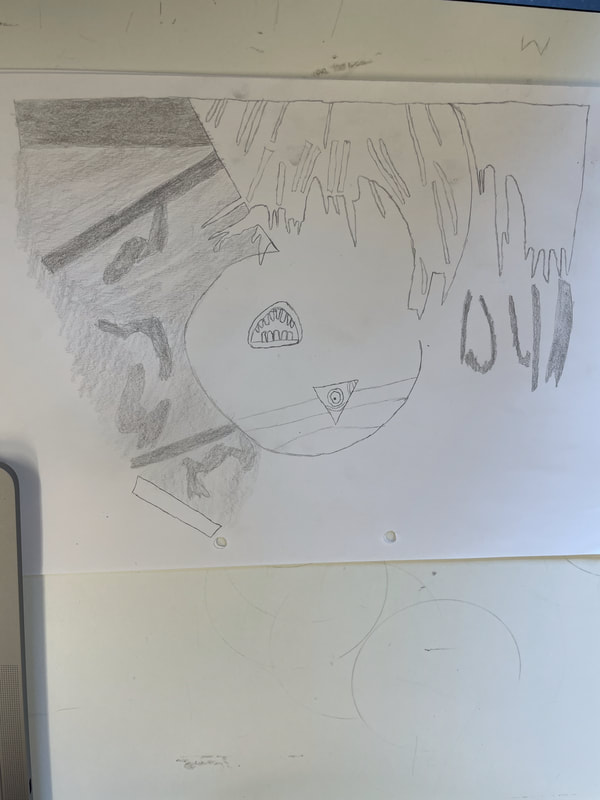
As you can see, this is the readymade picture that I drew and tried to replicate Hannah Hoch's famous photograph. This drawing is the wrong way round, but you get the idea of what I tried to do. On the right is where I have done my shading for the picture, and the left is where I thought I could improve on.


These are the eight pictures that I took of my google earth pictures that I printed off, and these are where I stuck my pictures onto with blu tac. I stuck these on different hanging mirrors in the first four pictures, then inside a box for the other two and then the last two are on a wall overlapping each other.
WWW: I think that my last two pictures that I took of my images on the wall went really well, and mix quite well especially with the overlapping of each other. I also think it looks quite realistic as if it is something that you would see here and there, with pictures on the wall.
The other pictures stuck on the moving mirrors also look quite creative in my opinion, and was even better when I was watching them move with the air pushing them swinging in different directions.
EBI: I think that the pictures that I stuck inside the box could be seen as quite boring, as it isn't the most creative idea out of them all and also not with a lot of for example colors and not a lot going on in the picture.
Y10 Making Day


These two images above are different to my other two images above, these both include the same background but i created in a different way. In these two images i had a circle cutter and cut out two circles from my work, afterwards i used these two circles and placed on my other piece of work which is the first set of images that i spoke about further up my making day section. This work just like my first piece is placed on cardboard, for my work to be more thicker and stronger rather than to just create my work without any strength and for my circles to be stuck on a sturdy background; this will also make my work stand out more.
These two pictures are showing the work that i completed during my making day, as you can see i was inspired by using circles as i used some picture books to cut out some images that caught my eye; after this i used a circle cutter to decrease the size of my images into circles. After this i used cardboard and in which i stuck a background picture onto the cardboard, then stuck my circles onto my background and the two pictures above are my final outcomes.
WWW: In my opinion i have aligned my circles in a nice order of arrangement, which includes circles overlapping each other, and my circles that i chose also involve some colour including the two circles with fire on which i thought blended well in my work. The circles in my work are also set in like a big circle, which links well to the theme of my work which is circles, and that they are all in the centre of my work and all go well together inside the big circle.
EBI: I think to improve my work i maybe could have scattered more circles across my work, perhaps to cut some circles with a circle cutter from the images below which has the same background as my main work above. I would have chose to stick these circles on the sides of my work above, to add more detail, cover more of the background, and i also think that this idea would link well to the circle of circles in the centre; with even more circles sort of circulating around it on all four sides.
