The first picture on the left is a picture by Francis Bruguiere The second picture on the right is a picture by Jerry Reed
The first similarity of both of these photographs is that both photographers have used paper in their piece, but the first photo on the left is a photo of paper in what looks to be cut up into different pieces, whereas the second picture looks like a big piece of paper covering something which hasn't been cut up like the photo on the left.Another similarity that these artists also have in common is that both of the photos have shadows in their photo like at the bottom and the top, and both photos are also taken in black and white however on the left there is more white than the picture on the right.
If I was to re-do these photographs the equipment I would use is sheets of paper and scissors to cut the paper like the artist has done on the left.On the photo on the right I would get a big piece of paper and bend it like a circle and also make it surround something which is a bit like Jerry Reed has done.
Noticing The Light
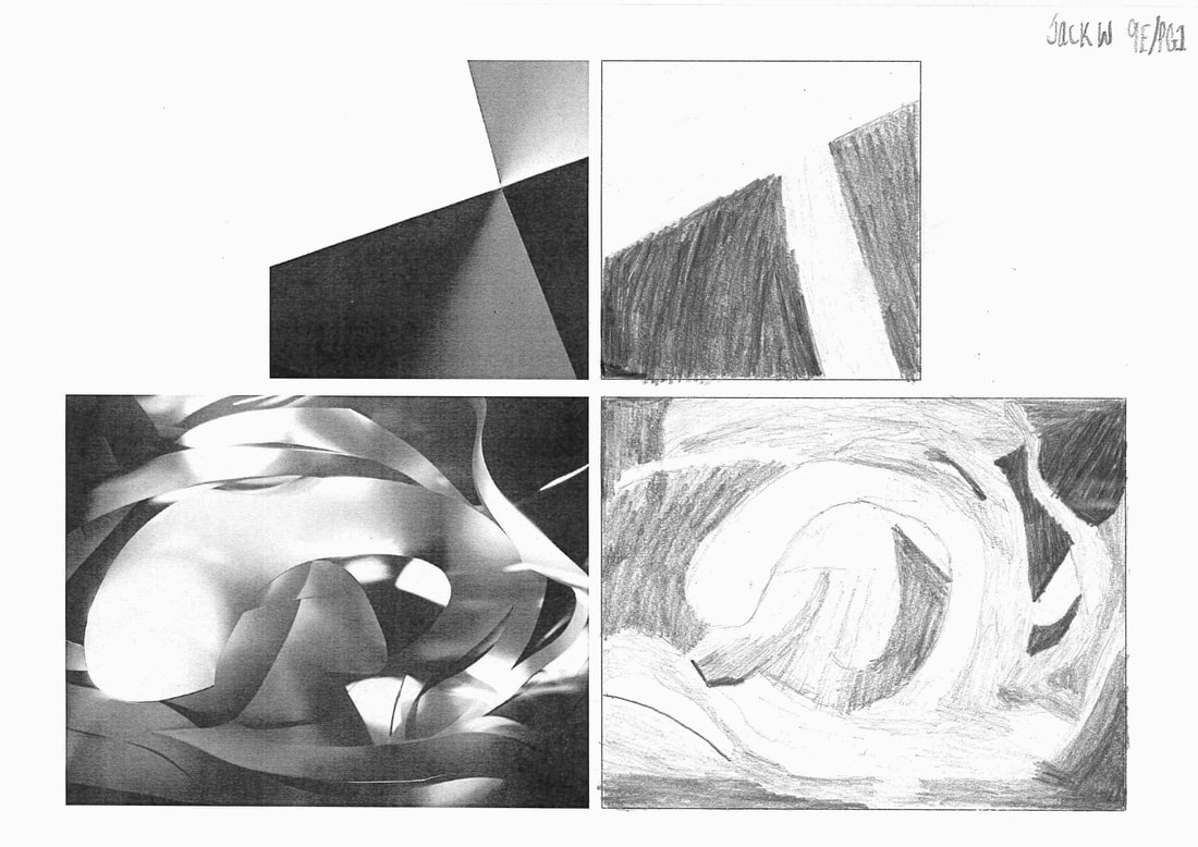
This drawing here is a drawing by myself, i done this in my photography class as I tried to recreate these two pictures by Jerry Reed and Francis Brugiere.I could have done better in my attempts maybe to make it more detailed but if I was to do it again, i think I would know how and what to improve on.
Concertina Book


These are two pictures of what a concertina book can look like.Concertina books are basically a slideshow of different pictures made from using paper and this will also include lots of folding to make it.To make this you will also need scissors to cut certain bits but you must carefully cut it to try and not cut it too much.
Edges using post it notes


Comparing Two Images


These pictures are made out of paper and are used by folding and using different techniques like curving.There is also light involved in these pictures like on the left it is light and on the right it is darker.
There is different lines in these pictures for example on the left you can see more lines from the cutting and the edges, where on. the right from lines from the paper also from things like cutting and curving, so on the whole both pictures have both got some lines.
The light is darker on the picture on the right but on the paper you can see light sort of reflecting onto it, but the dark does make the picture stand out.Whereas the one on the left makes the bright light on it, making it look simple and uninspiring.This picture also hasn't got a lot going on and isn't really look like someone put a lot of effort into it.
I certainly prefer the picture on the left because the darker light makes it look really stand out, where the other one looks really amateurish with not a lot going on and there is no real fascinating light reflecting either.The one on the left is also really well presented and has a lot of good detail which is the opposite to the one on the right which isn't really finished and is presented poorly.
Assessment
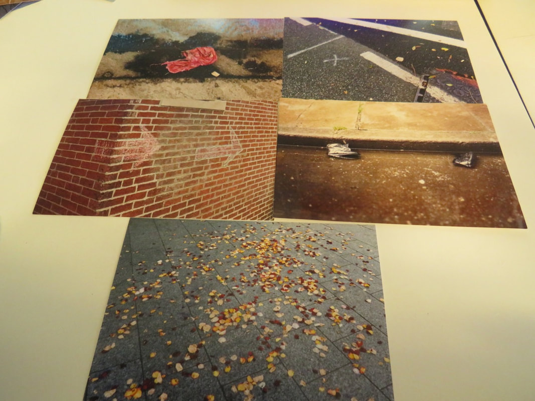
I had to choose five photographs for my assessment to use for taking twenty photos of these in different places in the school and I chose these five and this is why I have chose these photos:
A reason why I chose these photographs was because I thought that most of these pictures are things that you see in everyday life like school or anywhere on the streets.So I thought I could maybe blend these photographs for example maybe place the photo of the concrete floor on the concrete floor which is outside.
The main reason however is because I thought these photos are realistic for example there not things that you don't see wherever you go and I like realistic photos more than unrealistic ones .
I also liked these pictures because I thought that there was not a lot going on in them so the photo isn't too cramped with lots of things in them.These photos also can be different for example the one on the top left is a picture of a normal flat surface but with something on it which makes it stand out a bit.


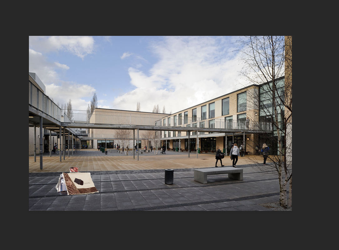
These are my five photos that I chose and I had to select different places in the school to place them, and then take a photograph of them and these are the places where I put them.One of my favourite photos out of all these is the eleventh one on the second row because I think it looks quite different surrounded by other pictures that have been done,also its not the same colour as the other surrounded pictures so it doesn't blend in too much or matches with colours.I also quite like the fourth one because I think it looks good being placed on the corner of the lines and it isn't too predictable as I haven't just put it near the lines or in the middle,i also think it looks good with the colours of the lettering behind it and also sitting on the orange floor so the colours I believe does make it stand out more.Maybe one of the pictures that could have been better was my third one because I guess theres not a lot going on in the picture as the background is just white and isn't as much colours in it as much as the fourth or fifth one, it can also be quite simplistic as all I've really done is place it on top of a charger cable which didn't really involve lots of thinking for where I could have put it.
Pictures Using My Sculpture


One of my tasks in my assessment was to create a sculpture by only using my five pictures,sellotape and scissors and this is what my final piece looked like.In my opinion it looks like a small cottage as I made the sides bend as I stuck them to make it look like a sort of house, when I done that I then put some of my remanding pieces to make a sort of door on the two ends to make it stand out or also to make it quite obvious so people might know what I had completed for my sculpture.After I done this I then had to find places for them to make a photograph similar to what I did with my other photo task and these are the different places inside and outside where I decided to photo them.I decided to take some outside this time for different surroundings which would be different from my other photographs I took because I can't do everything or keep everything the same because it would get predictable.A photo that I thought went well was the one I placed in the middle of the tree top because I thought it was different from others and I thought it was a good place to put it as it fits well in the middle of the tree.Another one I like is the fifth one as it looks good with the stair lines behind it as I also thought it looked quite caged with the lines as well.A picture that maybe I could have done better was the fourth one sitting on the floor and although the floor colour makes it look a bit better its not really busy like theres nothing behind it or in front of it which makes it a bit too or less impact during the photograph.
Photoshop With Sculpture